Nuances
On Markings
Overview
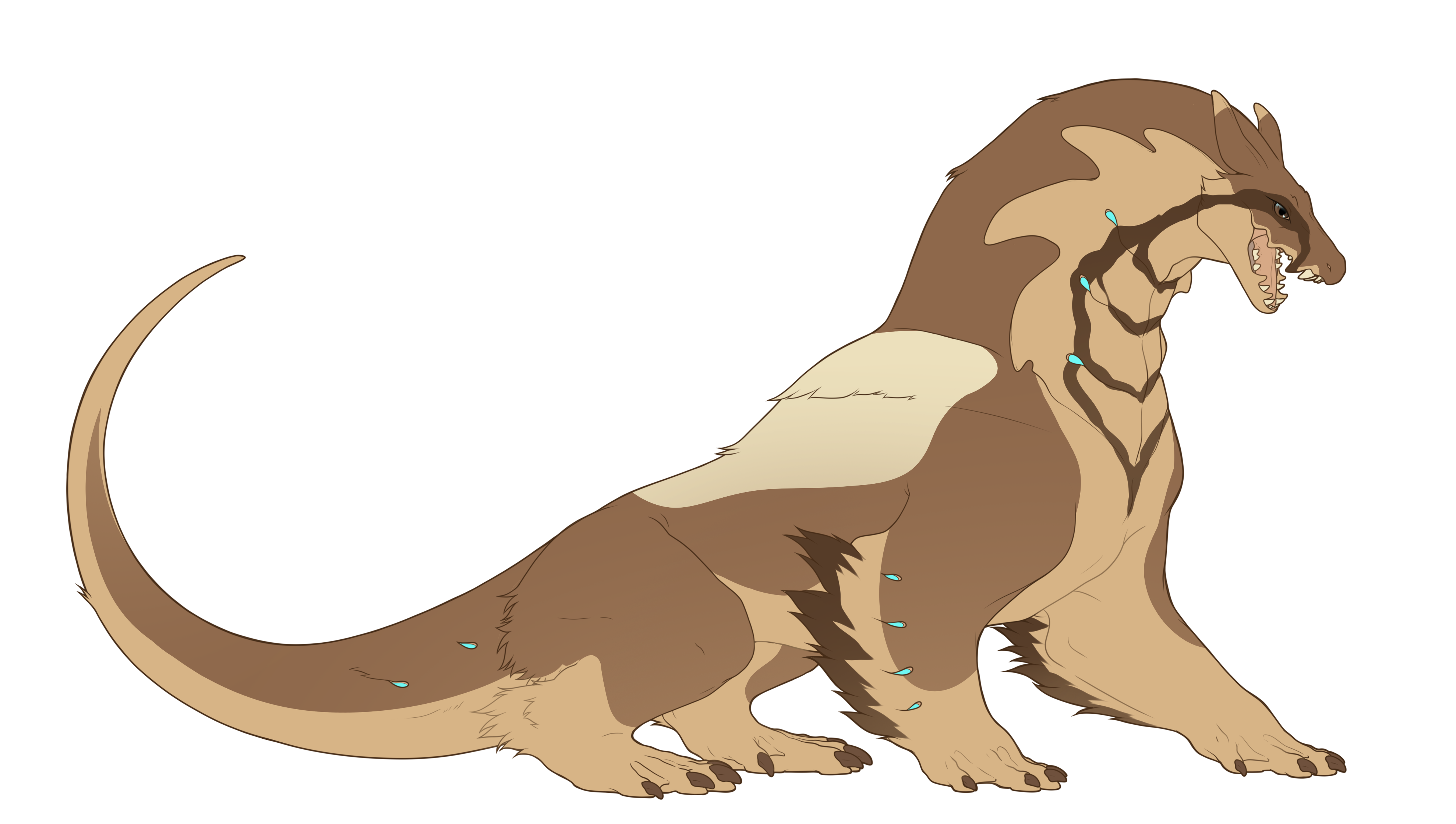
They say the subtle nuances in a citizen's markings are whispers of the cosmos, reflecting the depth and diversity of their individual spirits.
 Rules
Rules
|
Disclaimer
-
Nuances, Not Drastic Changes: The gradients on your Rexal's markings are meant to be nuances or slight variations in color. They are not meant to create a drastic change in the overall color of the marking. Think of these gradients as a subtle touch to enhance your design.
-
Risk of Corrections: While we aim to be as lenient and accommodating as possible, please understand that going overboard with color deviations might lead your design to be sent for corrections. Nuances in your Rexal's markings are meant to enhance and highlight your design, adding that extra 'pop', rather than replicating other markings. They'll be evaluated with this focus on design enhancement in mind.
-
Case-by-Case Assessment: Each design is evaluated on a case-by-case basis. Sometimes, even if the color deviation might technically be within the allowed range, if it visually appears too harsh or drastic, it might be flagged for corrections. We are only human and do our best to maintain consistency.
We understand the creative process involves taking risks and pushing boundaries, and we encourage that! Just remember that these rules are in place to maintain a balanced and harmonious design environment for all our users and for our mods to be able to judge swiftly and without roadblocks. Happy designing!
Remember, the goal is to add depth and richness to your Rexal's markings, without drastically altering their appearance.
Markings and Color Gradients
You have the freedom to choose the colors for these markings, but there's a twist - the color can have a gradient effect, giving your Rexal a more lifelike and dynamic look!
Now, what does a gradient mean?
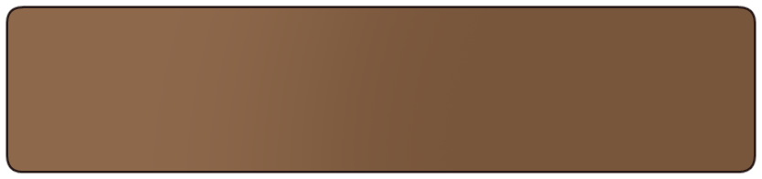
Think about a beautiful midday sky. Notice how the color changes gently and subtly from one shade to another? That's a gradient. In the case of your Rexal, it means the color of your markings can change very slightly across the marking itself.
The Right Nuance
In designing your Rexal, the gradients you apply to your markings should be seen as subtle enhancements, or nuances, rather than major changes to the color scheme. They are there to add a touch of depth and richness to your design, making it more lifelike and engaging.
It's important to understand that while gradients are allowed, they should be very subtle. Imagine the color change like a gentle whisper, not a loud shout. A light touch, not a heavy hand. That's the kind of gradient we're talking about.
So how do you achieve this? Here's a simple way to understand it:
-
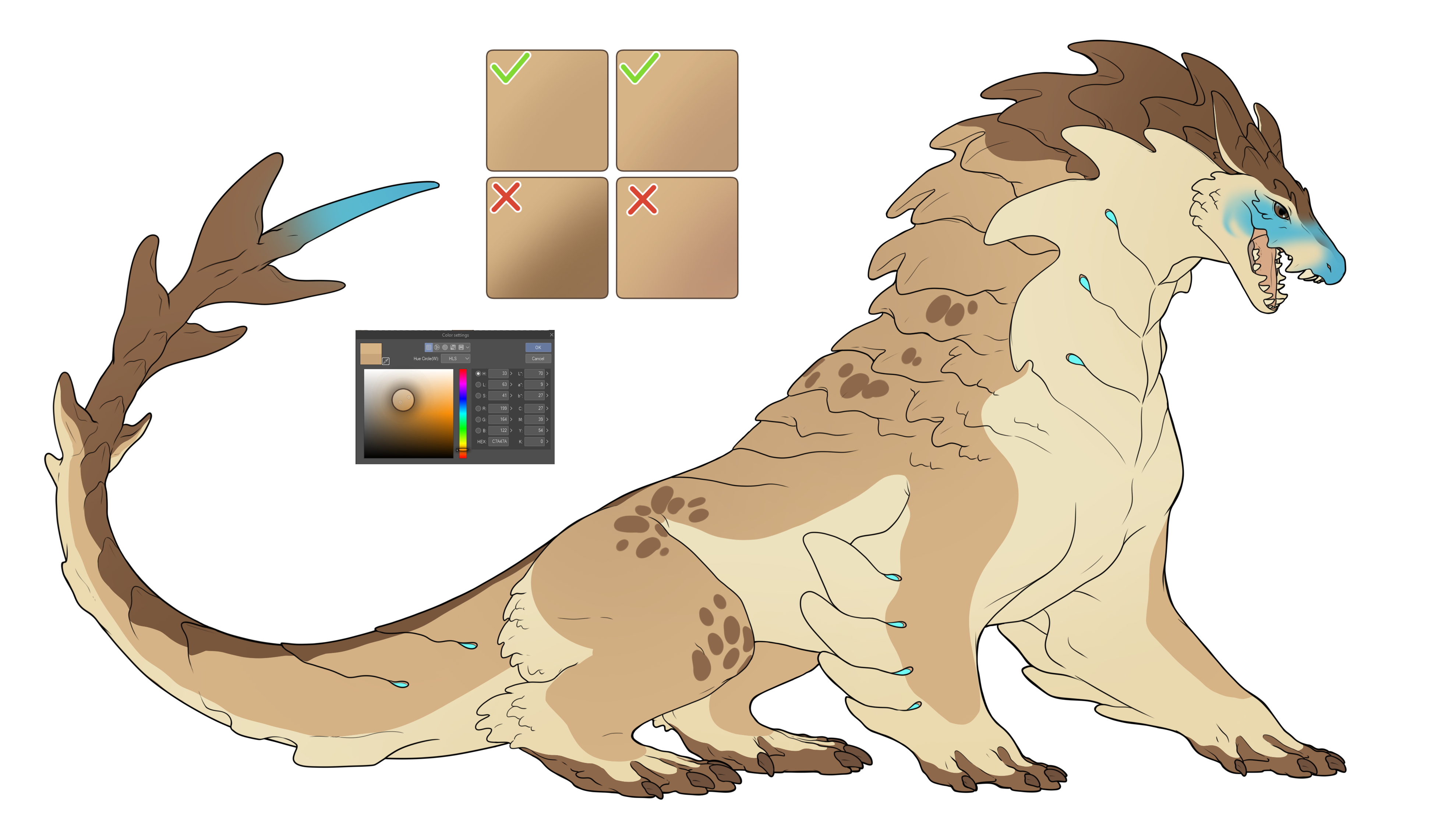
Color: The gradient should not drastically change the color of the marking. If you start with blue, it shouldn't end up looking green or purple. It should always look like a shade of blue.
-
Brightness: The gradient shouldn't make the marking go from very bright to very dark or vice versa. If your color starts as a sunny yellow, it shouldn't end up as a deep, dark gold.
-
Intensity: The gradient shouldn't make the color go from really vivid to really pale. If you start with a vibrant red, it shouldn't end up looking like a faint pink.
The key point here is subtlety. The gradient should be so slight that it adds a touch of depth to your markings without significantly changing the overall color.
NOTE:
An important thing to keep in mind when designing your Rexal is that not all screens display colors in the same way. The brightness, contrast, and color settings of a screen can affect how the nuances in your design are displayed. What might appear as a subtle gradient on one screen might look more drastic on another. Therefore, we strongly recommend checking your design on multiple screens, if possible.
 |
Why Subtle Gradients?
You might wonder, why does the gradient have to be so subtle? Well, Rexals are creatures with unique genetic markings, and these markings help us identify and distinguish them. If the gradients are too harsh, it becomes difficult to tell if the markings have been applied correctly. It's like trying to recognize a friend wearing an extravagant costume - it can be quite challenging!
So, we encourage you to use gradients sparingly and subtly, as a way to add depth and richness to your Rexal's markings, but not so much that they alter the fundamental look and feel of your Rexal.
However, it's important to remember that there's a fine line between enhancing your design and altering it too drastically. While our team strives to be as lenient and understanding as possible, going too far with color deviations might lead to your design being sent for corrections. This is a necessary step we take to ensure the integrity and consistency of Rexal designs within our community.
We evaluate each design on a case-by-case basis. Sometimes, a gradient may technically be within the allowed range, but if it visually appears too harsh or drastic, it might be flagged for corrections. We're only human, and we do our best to apply these guidelines consistently.
Why Only Hard Edged Markings?
When designing your Rexal, you might wonder why gradients are allowed on hard-edged markings but not on soft ones. The answer lies in how we judge and evaluate your designs.
Hard-edged markings have clear, distinct boundaries, which makes the presence and extent of a gradient easy to discern. It's like drawing on a piece of paper with a sharp pencil – the lines are clear and unmistakable.
On the other hand, soft markings are like drawing with a piece of charcoal or a smudged pencil. The edges blend and blur, and it's harder to tell where one color ends and another begins. When gradients are applied to soft markings, it can sometimes create a confusing visual effect, making it difficult for our moderators to accurately judge the design.
We want to ensure that all designs are evaluated fairly and consistently, and limiting gradients to hard-edged markings helps us achieve that goal.
Values? Hues? What's the point deviation here?
NOTE:
Please note that the HLS values mentioned here are intended as a helpful guide to assist you in your design process. They are not absolute rules or the final determining factor in the evaluation of your Rexal's design.
Given the vast array of design programs out there, each with its own way of calculating and displaying color, we understand that these values might not apply universally. Our design moderators take into consideration these variations when reviewing designs.
The final decision rests with our design mods, who evaluate each design on its own merits. These are just meant to help you and are not used by our design moderators to judge.
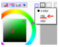
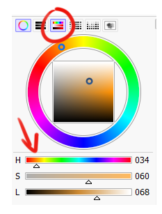
To achieve the most consistent results, we recommend using the HLS (Hue, Lightness, Saturation) color mode for your design.
Let's break down the HLS color mode:
-
Hue: This is essentially the color itself - think of a spot on the color wheel. For hue, aim to keep variations within 5 points to maintain consistency in your Rexal's color scheme.
-
Lightness: This refers to how light or dark the color is. For lightness, try not to deviate more than 15 points from your original color.
-
Saturation: This measures the intensity or vibrancy of the color. Generally, try to keep saturation changes within 10 points. However, we understand that saturation can be particularly dependent on the color itself, so we tend to be more lenient with it.
Although these are good general guidelines to keep in mind, the best way to understand what we're looking for is by checking out the example image above. It gives a clear visual representation of these guidelines in practice.
The topmost images's tears of this guide, for example, shows the absolute maximum of a gradient you can achieve with this. This, however, is already very borderline, and might be pinged if the color presents more saturated. So please be careful!
How to use this mode in different programs?
Here are Sai 1.0, Sai 2.0 and CSP
 |
 |
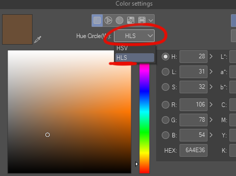 |
For Photoshop and any other program that does not use HSL sliders, you can always use this:
HSL COLOR PICKER
| We can't wait to see the amazing Rexals you'll create with these guidelines! Remember, it's all about expressing your creativity while honoring the unique genetic traits of our Rexals. Happy designing! |